Core Data Lab 3.0: Favorites, diagrams and more
Core Data Lab 3.0 adds support for Liquid Glass, introduces the concept of ‘Favorite attributes’ and ‘Favorite content’, adds a Relationships panel to the Object editor window, lets you visualize your data model with diagrams, plus a lot of other improvements.
Liquid Glass
Unlike the previous major overhaul of the macOS user interface with macOS Big Sur, which turned out to be more or less acceptable after a few months of use, the current macOS Tahoe release, which is now on version 26.5, still gives the impression that the user interface design implementation needs seriously more finetuning, mainly due to all the issues with contrast and readability. Despite all that, we have done our best to embrace and implement the concepts of the Liquid Glass design in Core Data Lab 3.0, although with a few tweaks here and there to improve the contrast in especially dialogs.
Favorite attributes
Identifying rows in data often depends on attributes with names like ‘identifier’, ‘title’ or ’name’, which not seldom requires scrolling or adjusting the column configuration to make them visible. With ‘Favorite attributes’ you can configure default attribute names that are automatically placed in front or on top of other attributes. The setting is used when the app opens an entity or fetch request, when the content of the inspector or object editor window is rendered, and when the attributes dropdown of the predicate editor is populated. Favorite attributes is a global setting that works with all your projects and databases. The setting is located in the new Favorites section of the app settings.
Favorite content
The Content panel in the app shows the data of just one attribute of the selected object in the main table or relationships panel. Normally, the data of the first available attribute is shown, which can be changed by a dropdown list above the panel that shows all attributes of the selected object. With the new ‘Favorite content’ setting, you can determine which attribute is shown first, and which other attributes must be shown on top of the said dropdown list.
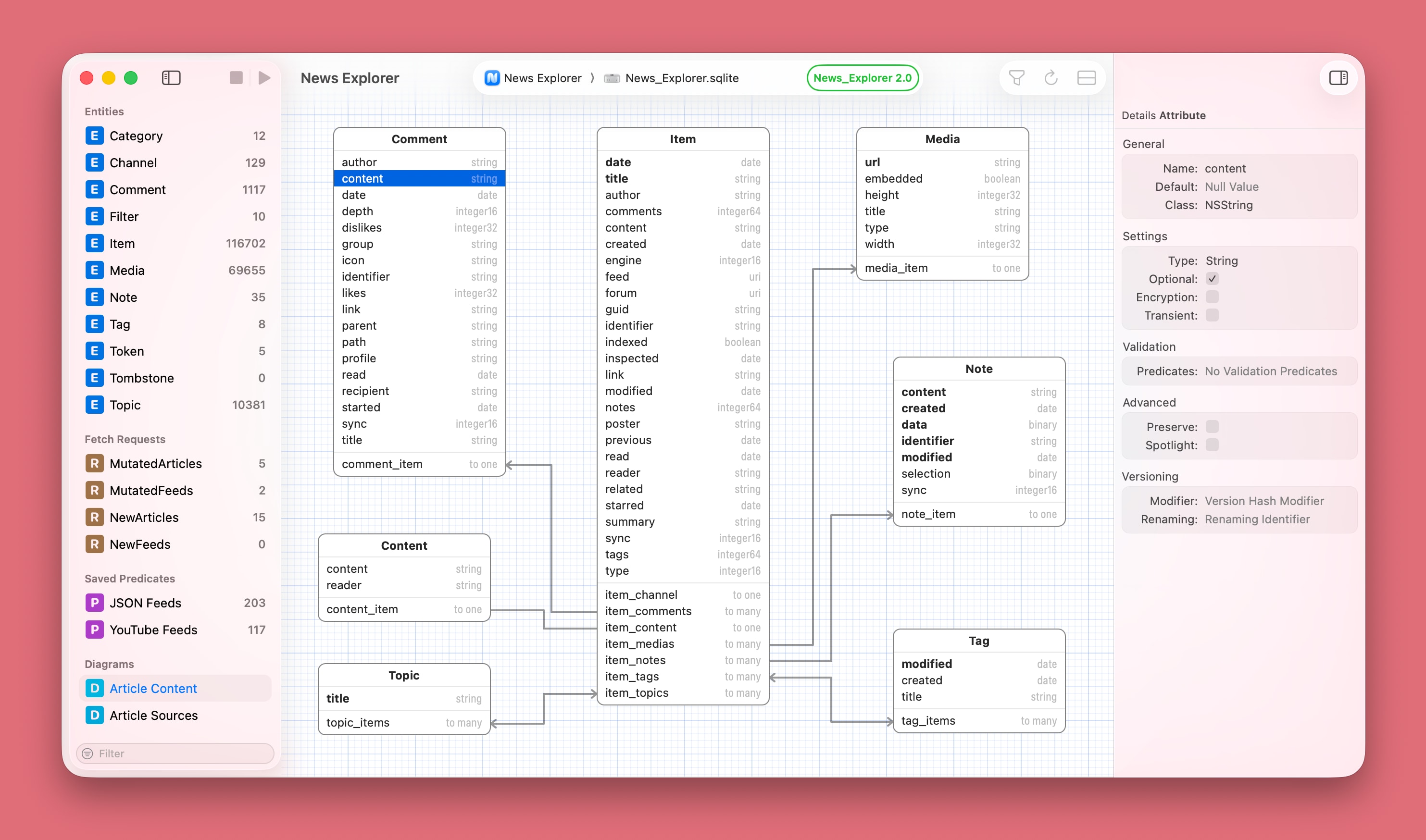
Model diagrams
Not a core feature of the app, but very nice to have: to visualize a Core Data Model in a diagram. You can add multiple diagrams to a project, and it’s easy to center each diagram around a few entities by excluding unrelated entities. The design is heavily inspired by the ‘graph style’ editor of the data model designer tool in Xcode 13 and older, which is funny enough still referenced in the official documentation about Configuring Relationships. The app settings are extended with a new ‘Diagrams’ section, in which you can tweak multiple aspects of how the diagrams are rendered.
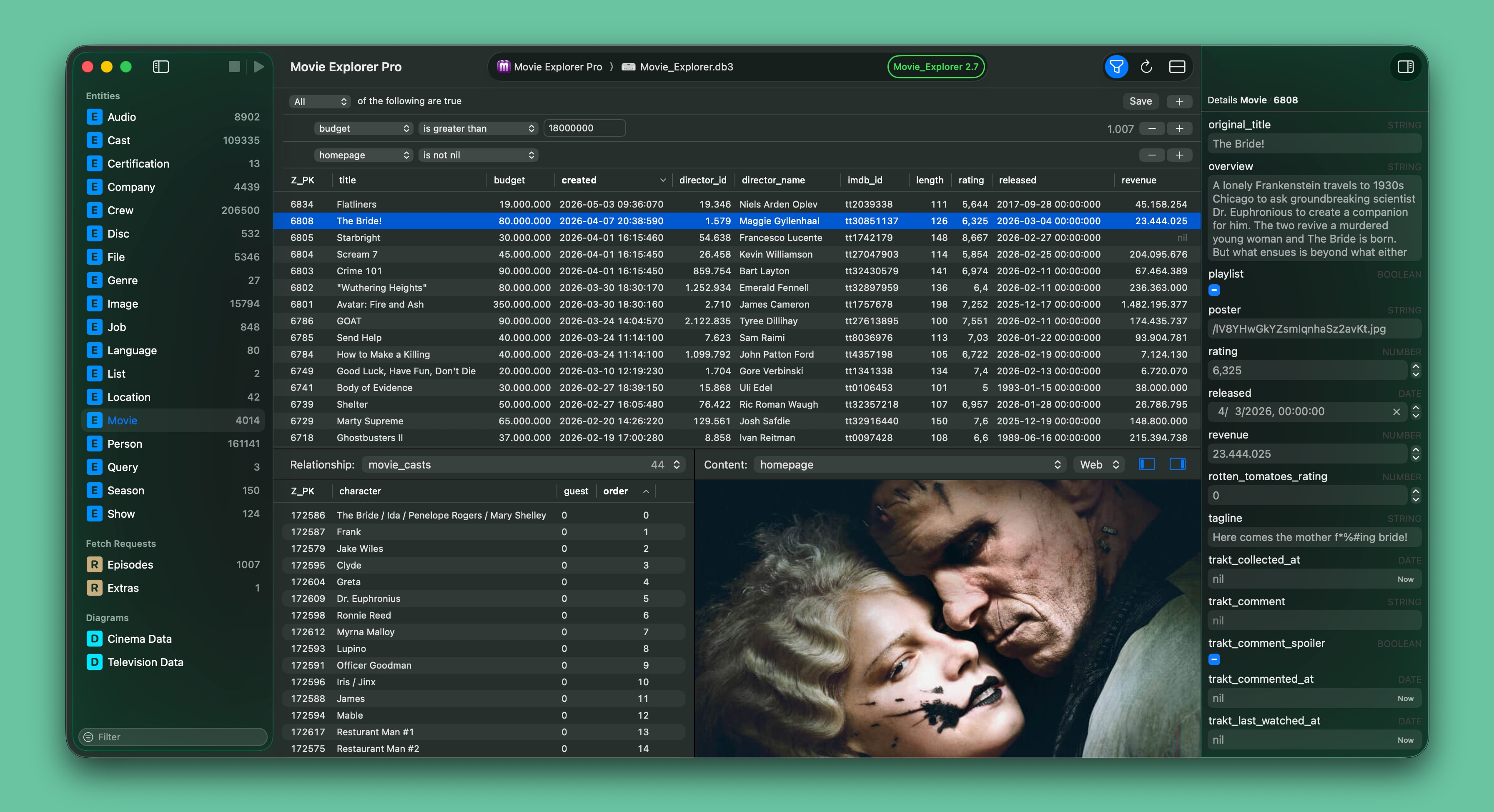
Improved object editor
The Object editor, which opens a Core Data object in a standalone window, has been extended with a Relationships panel. This means that you can inspect all relational data of an object directly in the Object editor. This makes it also possible to compare related data of multiple objects side-by-side. The Relationship panel is default hidden and can be made visible with a new button in the toolbar.
Fetched properties
Although a rather obscure Core Data feature, the app now supports Fetched Properties by displaying them as related data in the Relationships panel, and as metadata in the Entity Description view and in the new Diagram feature. When the selected entity has one or more fetched properties, then these are added to the dropdown of the Relationships panel below the relationships, and label ‘Relationships’ changes to ‘Related data’.
Other improvements
This update contains the following additional new features and enhancements:
- The Predicate editor now supports the Matches and Like operators for string types.
- You can now search within web content in the content viewer by using shortcut ⌘ F. This works when the web viewer is the focused control.
- A new performance setting in the Advanced section lets you control whether the inspector must display deserialized Property List (PLIST) data.
- The visibility of all panels in the document window can now be toggled via the View menu.
- The number of supported image formats in the content viewer has been extended.
- The performance of displaying very long texts has been improved.
Other changes
This update contains the following changes:
- The document title is now a native NSDocument window control, which means that you can edit and tag the filename without leaving the document window.
- The performance app settings have been moved to the Advanced section of the app settings.
- Startup options of the app are now located in the Advanced section of the app settings.
- Entities and fetch requests in the sidebar can be made hidden via the context menu.
- The minimum required macOS version is 15.6.
- The app has a new icon with support for macOS 26 icon styling.
Downloads
Core Data Lab owners can download the update for free from the Mac App Store. If you are not yet a Core Data Lab user, you can try the app for free, for 14 days.
- Free 14-day trial: https://betamagic.nl/downloads/Core Data Lab Trial.
- Mac App Store link: https://apps.apple.com/us/app/core-data-lab/id1460684638.
« Back